Book Covers - Typography
They say, “Don't judge a book by its cover,” so a cover doesn't really matter
Forget the "don't judge a book by its cover" nonsense!
Do you even know how to recognise a good cover?
- What do you know about how colour affects emotions?
- Have you ever heard about the rule of thirds?
- Do you know about the golden ratio?
- How well do you understand typography when choosing fonts?
- How long should a title be?
- Is it worthwhile using a subtitle?
- Is your image appropriate?
- Are you allowed to use that image?
- What size cover do you need for ebooks and paper books?
Typography
The text on the front cover of a book should be the book title, the author name and possibly a subtitle. The back cover will normally contain the book's description and possibly information about the author You may also find on traditionally published books some reviews or mention of best selling books the author has published.
Canva, a site which helps authors design book covers, has an excellent guide page which helps choose fonts which go well together.
Font Choice
Each font can be used to create a 'mood'; The reader is led to expect a book has that mood.
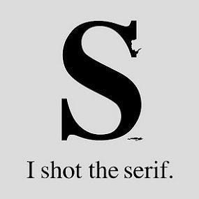
- Serif fonts represent convention and formality. Not know what a serif is? See the cartoon on the right.
- Modern serifs are associated with gloss and glamour. You'll see these on the covers of magazines such as Vogue.
- Slab serifs are used to grab attention and highlight the content’s importance. Slab serife fonts are those with square or rounded serifs - like the ones in the 'I shot the serif' cartoon.
- Sans serif fonts are neutral and simple. These are often used in non-fiction. (sans = without)
- Bold fonts relate to importance and strong key messages.
- Handwritten fonts are mostly elegant and distinctive. They are often used on the cover of romance novels.
- Mono-spaced fonts are those where each letter takes up the same space whether this letter is an 'm' or an 'i'. They are used to send a clear and sharp message. Often used where computer code is involved.
- Rounded fonts, where each stroke is rounded at the ends, are friendly, lively and informal. Often found in children's books.
- Gothic typography is often used in horror or historical stories.
- Grunge fonts as Google says are a little rough around the edges. There are countless varieties of grunge, from a little bit of texture or weathering to full-on distressed, scratched, distorted, and broken letterforms. Often used for horror or something mystical and magical. See the Green Mile example.
If you find this guide useful...
If you find these pages useful you can return the favour by downloading a FREE ebook from Amazon - even if you don't read it, it will help our rankings! I think you'll probably like it though.
Take a touch of humour, add some genetic science and nanotechnology. Steep with conspiracy and stir in murder and despair. Season with romance between three people in a secret location. Garnish with morality.
The result is 'Immortality Gene', the first in a novel series by John and Shelia Chapman. The ebook of book 1 is FREE and available at multiple retailers

Font size
Remember that Golden Ratio of 1:1.618 ? If you take the basic font size of a book as being 10 point then increase this in stages by the Golden Ratio then this is what you get:
10 point text
16 point text
26 point text
42 point text
68 point text
111 pt
- Consider using three adjacent font sizes from this list for title, author and subtitle. If you find this too large then decide on the largest text size and multiply it by 0.618 for the next size .
- If you are a well known author with multiple books consider using the largest font on your cover for your name. It is, after all, your 'brand'.
- Subtitles can be used to make clear your book's genre if any image and the title don't. They are also great at holding keywords which make your book easier to pick out from the millions of other books.
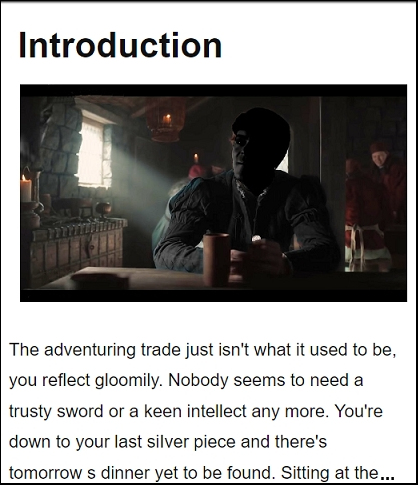
Or maybe a free online interactive adventure story?
Back in 1982 early text only adventure games were being written for home computers. One such game was 'Castle of Riddles' written by Peter Killworth and published by Acornsoft. Now it's been re-written and greatly expanded with added images and sound. Play it on your computer, tablet or even a phone.
Check it out at https://jaydax.co.uk/corr
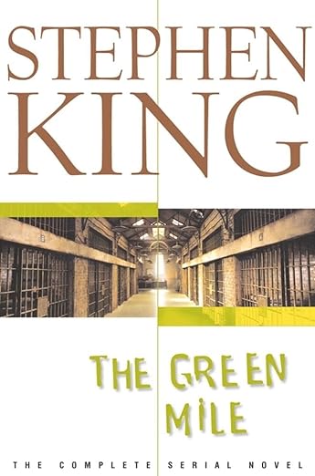
In this example the name of the author is displayed top left in a larger font than the name of the book which is at the bottom right. This draws the eye of the western reader across the cover in the same way they would read a page. The remaining third displays the image, a prison, the main theme of the book. The book title is in an eroded font suggesting the story is set in the past. Note the authors name is a major feature because this is his 'brand' and is what a reader would look for when purchasing another of his books rather than the title. The Green Mile was originally issued as a series of six serial novels. In the example the publisher has used the subtitle area to make clear this is the complete story.
Want a short story instead?
I've written a number of short time travel stories. Each is 99p/99¢ and great for taking a break from writing.
Check them out at http://iwadasn.info
Text only covers
Take a look at these images. Each is of a book cover where text is used to good effect and there is no book cover illustration.
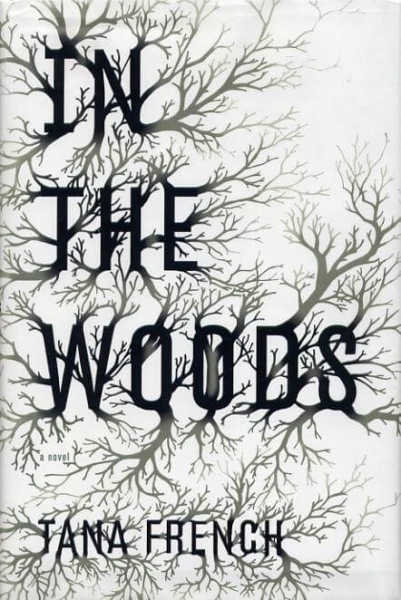
In this cover the font used has been extended to give the effect of branches. The text effectively becomes part of the artwork.
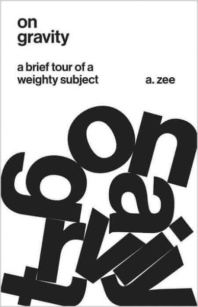
In this cover the title is written twice but the larger, presumably heavier, letters have fallen into a jumbled pile at the bottom of the cover. Personally I think the cover is a clever idea but could have been improved by not using all lower case letters.
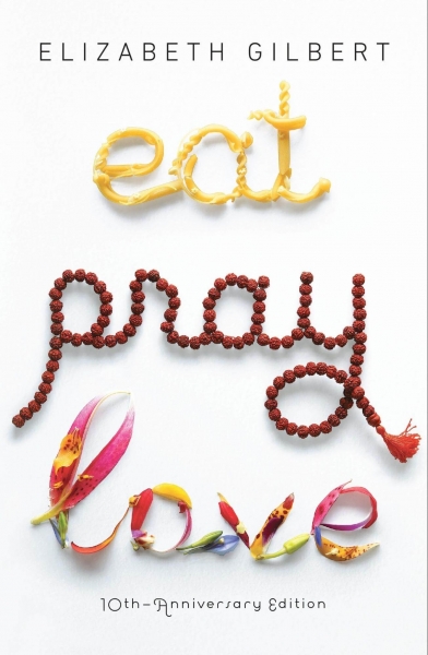
In this cover the title text is written with an unusal combination of fonts. The top 'Eat' uses a font made up of pasta shapes. The 'Pray' is written in a rosary bead font. The 'Love'uses a script font filled with flowers
Shaped text
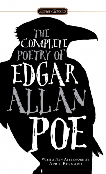
In this cover the title text is confined by an outer image. The font is an 'eroded' grunge style in keeping with horror genre. The black on white background image enhances that effect.
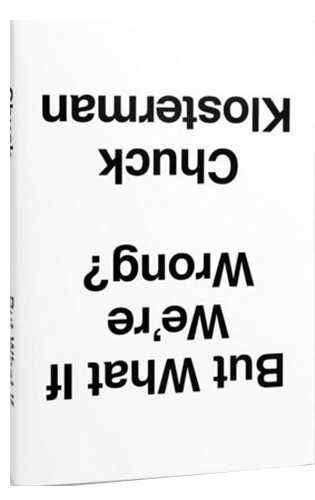
A clever text only book cover
Next page: Images, Titles and Subtitles
As an Amazon Associate, I earn from qualifying purchases.