Book Covers - The Rule of Thirds and Gloden Ratio
They say, “Don't judge a book by its cover,” so a cover doesn't really matter
Forget the "don't judge a book by its cover" nonsense!
Do you even know how to recognise a good cover?
- What do you know about how colour affects emotions?
- Have you ever heard about the rule of thirds?
- Do you know about the golden ratio?
- How well do you understand typography when choosing fonts?
- How long should a title be?
- Is it worthwhile using a subtitle?
- Is your image appropriate?
- Are you allowed to use that image?
- What size cover do you need for ebooks and paper books?
Rule of thirds
 The rule of thirds is where your focal point, usually a title or center element takes up one third of the cover. The 'thirds' can be interpreted as three clear sections. The remaining two thirds, are left open for background elements. The 'thirds' can be divided, vertically, or diagonally.
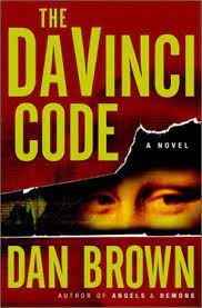
In this example the images of the Mona Lisa eyes are a contrasting focal point making eye contact. The remaining thirds display the book title and the author's name. Note the authors name is a major feature because this is his 'brand' and is what a reader would look for when purchasing another of his books rather than the title 'The da Vinci Code.
The Golden Ratio
Take a look at these images. You'll probably find the copy on the right pleasing to the eye. The reason is that it follows the 'golden ratio.' I've outlined that in red on the image on the left
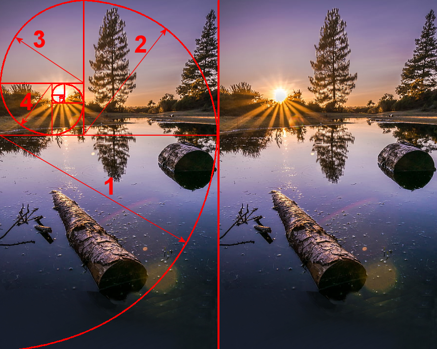
If you look at the red square bottom left (1) you'll see that you could draw the red arc using a compass centered at the top left of the square. The ends of the floating logs fit nicely within this arc.
If we now place another square (2) at the top right of square 1 and make is size 0.618 the size of square 1 and again draw an arc we begin to see the start of a spiral. If we continue to do this we'll end up with a spiral centered on the rising sun.
If objects in the image are aligned to fit this spiral we end up with an eye pleasing image.
Incidentally the inverse of 0.618 is 1.618 and the ratio 1:1.618 occurs frequently in nature although we are not normally aware of it. For example the length of a hand compared to a forearm is normally hand (1): forearm (1.6). Any deviation from this ratio and the arm looks odd.
If you find this guide useful...
Can you help me out?
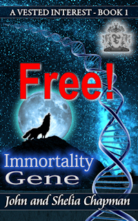
If you find these pages useful you can return the favour by downloading a FREE ebook from Amazon - even if you don't read it, it will help our rankings! I think you'll probably like it though.
It's the first book of a series of 9 books (so far) which tell the story of how life on Earth was saved from a cataclysmic extinction when a rogue planetoid collides with Earth in 7141. This first book deals with how humanity was made immortal, giving us the incentive to do something about an event so far in the future.
Take a touch of humour, add some genetic science and nanotechnology. Steep with conspiracy and stir in murder and despair. Season with romance between three people in a secret location. Garnish with morality.
The result is 'Immortality Gene', the first in a novel series by John and Shelia Chapman. The ebook of book 1 is FREE and available at multiple retailers
Get it from your favourite store
Further reading
The following are links to external sites I've used on the emotional effect of colour.
Color Psychology: Does It Affect How You Feel?
Color Psychology: How To Use it in Marketing and Branding
Color Psychology: How Do Colors Affect Mood & Emotions?
Interesting (but irrelevant) factoid
The book title 'The Da Vinci Code' implies that Leonardo's surname was 'da Vinci'. This is wrong, it simply means 'from Vinci'. The title would be more accurate if it was 'The Leonardo Code.'
Are we too fixated on the Golden Ratio?
Next page: Book cover typography
As an Amazon Associate, I earn from qualifying purchases.
Want a short story instead?
I've written a number of short time travel stories. Each is 99p/99¢ and great for taking a break from writing.
Check them out at http://iwadasn.info