Setting up the styles for your book
Any style in MS Word can be changed. Right click the style in the style window and choose 'Modify'. You can also create a new style.

These are the styles I use in a book:
Normal - The style used for the main text. Notice how it's indented a little.
Here's how MS Word describes it:
Font: (Default) Garamond, 12 pt, English (United States), Indent: First line:  0.5 cm, Justified
        Line spacing:  single, Widow/Orphan control, Style: Show in the Styles gallery
No Indent - a style used for the first line following a heading or page separator. It is automatically followed by 'Normal' style. Notice how this style does not appear to be indented.
How MS Word describes it:
Indent: First line: 0.01 cm, Style: Show in the Styles gallery, Based on: Normal, Following style: Normal(Seems odd - a 'No Indent' style with an indent of 0.01 cm! But that amount of indent won't be noticed and printers seem to like it better than an indent of zero)
Heading 1
- the style used for chapter headings. It is automatically followed by No Indent style and is underlined.
How MS Word describes it:
Font: (Default) Cambria, 16 pt, Bold, Kern at 14 pt, Indent: First line:  0 cm, Centered,
          Space Before:  18 pt Space After:  12 pt, No widow/orphan control, Keep with next, Level 1, Style: Linked, Show in the Styles gallery, Priority: 10 Based on: Normal Following style: No indent
Heading 2
- a subheading; seldom used in fiction. It is automatically followed by Noindent style.
How MS Word describes it:
Font: Cambria, 14 pt, Bold, Left, Space Before: 16 pt Space After: 11 pt, No widow/orphan control, Keep with next, Level 2, Style: Linked, Show in the Styles gallery, Priority: 10 Based on: Normal Following style: No Indent
Heading 3
- a subheading; seldom used in fiction. Notice how the letter spacing is closer than in Heading 2
How MS Word describes it:
Font: Cambria, 13 pt, Bold, Condensed by 0.1 pt, Indent: Left: 0.2 cm First line: 0 cm, Space Before: 14 pt Space After: 6 pt, Keep with next, Level 3, Style: Linked, Show in the Styles gallery, Priority: 10, Based on: Normal Following style: No indent
Heading 4 - a subheading; seldom used in fiction. It is automatically followed by No Indent style.
How MS Word describes it:
Font: Cambria, 12 pt, Bold, Left, Space Before: 24 pt, Keep with next, Level 4, Style: Linked, Show in the Styles gallery, Priority: 10 Based on: No indent Following style: Normal
~~Separator~~
- a style used to separate text sections in chapters, It is automatically followed by No Indent style.
How MS Word describes it:
Centered, Style: Linked, Show in the Styles gallery Based on: Normal Following style: No indent
Title
- The style used for the book title on the title page
How MS Word describes it:
Font: (Default) Garamond, 36 pt, Bold, English (Australia), Kern at 14 pt, Centered Line spacing: single, Space Before: 141.75 pt, Widow/Orphan control, Style: Linked, Show in the Styles gallery, Priority: 11
Subtitle
- The style used for the book series title, subtitle and author name on the title page.
How MS Word describes it:
Font: 22 pt, Not Bold, Space Before: 56.7 pt Space After: 3 pt, Style: Linked, Show in the Styles gallery, Priority: 12 Based on: Title
emphasis - Used to emphasis a single word or for thoughts when telling the story using 3rd person omnipotent viewpoint. Used in quotes for the remote side of a telephone conversation.
How MS Word describes it:
Font: Italic, Not All caps, Style: Show in the Styles gallery, Priority: 21
script - Used for a handwritten note.
How MS Word describes it:
Font: Cataneo BT, Left, Style: Linked, Automatically update, Show in the Styles gallery Based on: Normal Following style: Normal
If you don't know how to modify styles or create new ones, this page at Microsoft explains how to do this at a basic level. There are several features available for Word Styles, such as how the underline in Heading 1 style is produced, which are accessed from the 'Format' button.
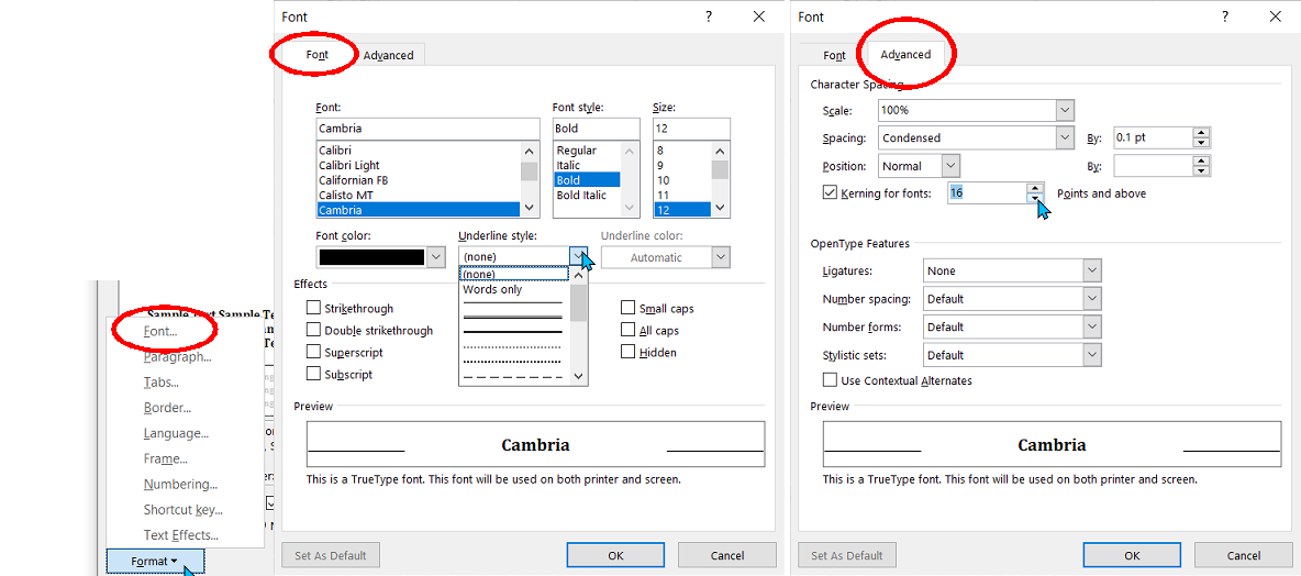
Format Font menu options
Here for example is how the Format button can be used to modify font styles:

Using the Format>Font option you can set a font to be displayed with several styles of underlining, be displayed with a number of effects.
Hidden text won't be printed;
Ligatures are letters which run together such as the a and e in Cæsar;
Kerning is a method of altering the spacing of large fonts so that the 'o' in Word fits slightly under the ascender at the back of the 'W'.

If you find this guide useful...
Can you help me out?
If you find these pages useful you can return the favour by downloading a FREE ebook from Amazon - even if you don't read it, it will help our rankings! I think you'll probably like it though.
It's the first book of a series of 9 books (so far) which tell the story of how life on Earth was saved from a cataclysmic extinction when a rogue planetoid collides with Earth in 7141. This first book deals with how humanity was made immortal, giving us the incentive to do something about an event so far in the future.
Take a touch of humour, add some genetic science and nanotechnology. Steep with conspiracy and stir in murder and despair. Season with romance between three people in a secret location. Garnish with morality.
The result is 'Immortality Gene', the first in a novel series by John and Shelia Chapman. The ebook of book 1 is FREE and available at multiple retailers

Get it from your favourite store

Everyone loves to laugh (with the possible exception of those with a severe case of diarrhea)
This is a book I found hilarious
Stairlift to Heaven: Growing Old Disgracefully
by Terry Ravenscroft

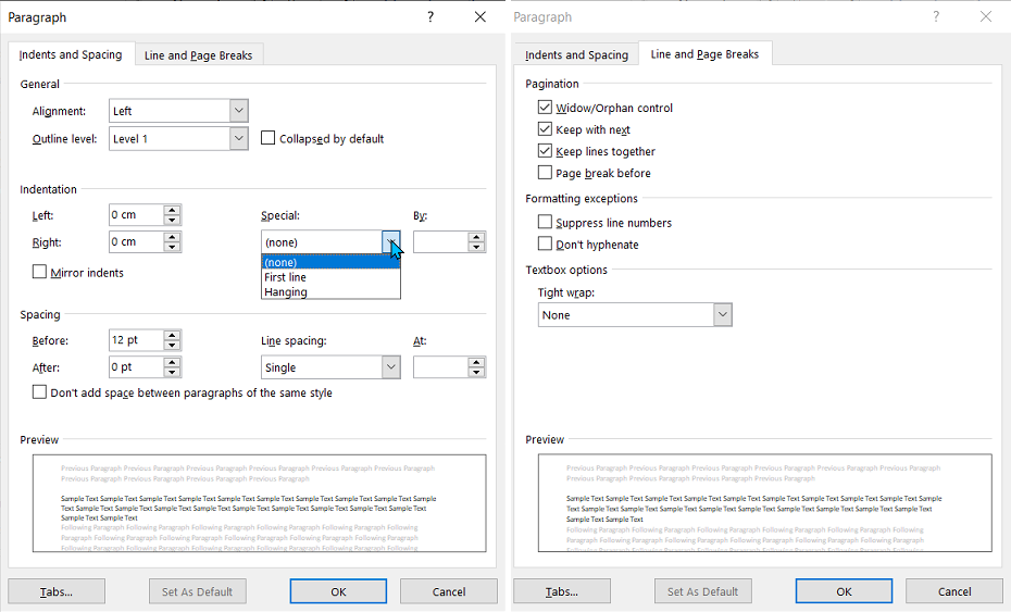
Format - Paragraph options
Here's how the Format button can be used to modify font styles:

The important points here are:
First line indent - this should be 0.5 cm for Normal style and script style and 0.01cm for No Indent style. This seems odd but without this indent problems can occur. A tiny indent of 0.01 cm won't be noticed. All the other styles don't need an indent.
Widow/Orphan control should be checked. A 'widow' is the last line of a paragraph which occurs on an otherwise empty page. An 'orphan' is the first line of a paragraph which occurs at the bottom of a page with the majority of the paragraph appearing on the next page. Every effort should be made to avoid widows. Orphans are sometimes acceptable.
Headlines should have 'keep with next' applied. A headline at the bottom of a page without the content it refers to looks very odd.
Or maybe a free online interactive adventure story?
Back in 1982 early text only adventure games were being written for home computers. One such game was 'Castle of Riddles' written by Peter Killworth and published by Acornsoft. Now it's been re-written and greatly expanded with added images and sound. Play it on your computer, tablet or even a phone.
Check it out at https://jaydax.co.uk/corr

Hint: There are places where you should wait until the coast (or tunnel) is clear. Other places, hanging around too long will get you killed.
Format - Border options
You'll need this to underline Heading 1 and the Title style. This is not the same as the underline option in the Font options which only underlines each letter. The border options draw a line under the title right across the page.

Format - The other options
You probably won't need to use the Tabs, Language, Frame, Numbering, Shortcut key or text Effects options.
Next: Content Formatting
As an Amazon Associate, I earn from qualifying purchases.
Want a short story instead?
I've written a number of short time travel stories. Four of them in a collection are 77p/99¢ and great for taking a break from writing.
Check them out at http://iwadasn.info

Get the collection via Books2Read